
Sacramento Dance Festival
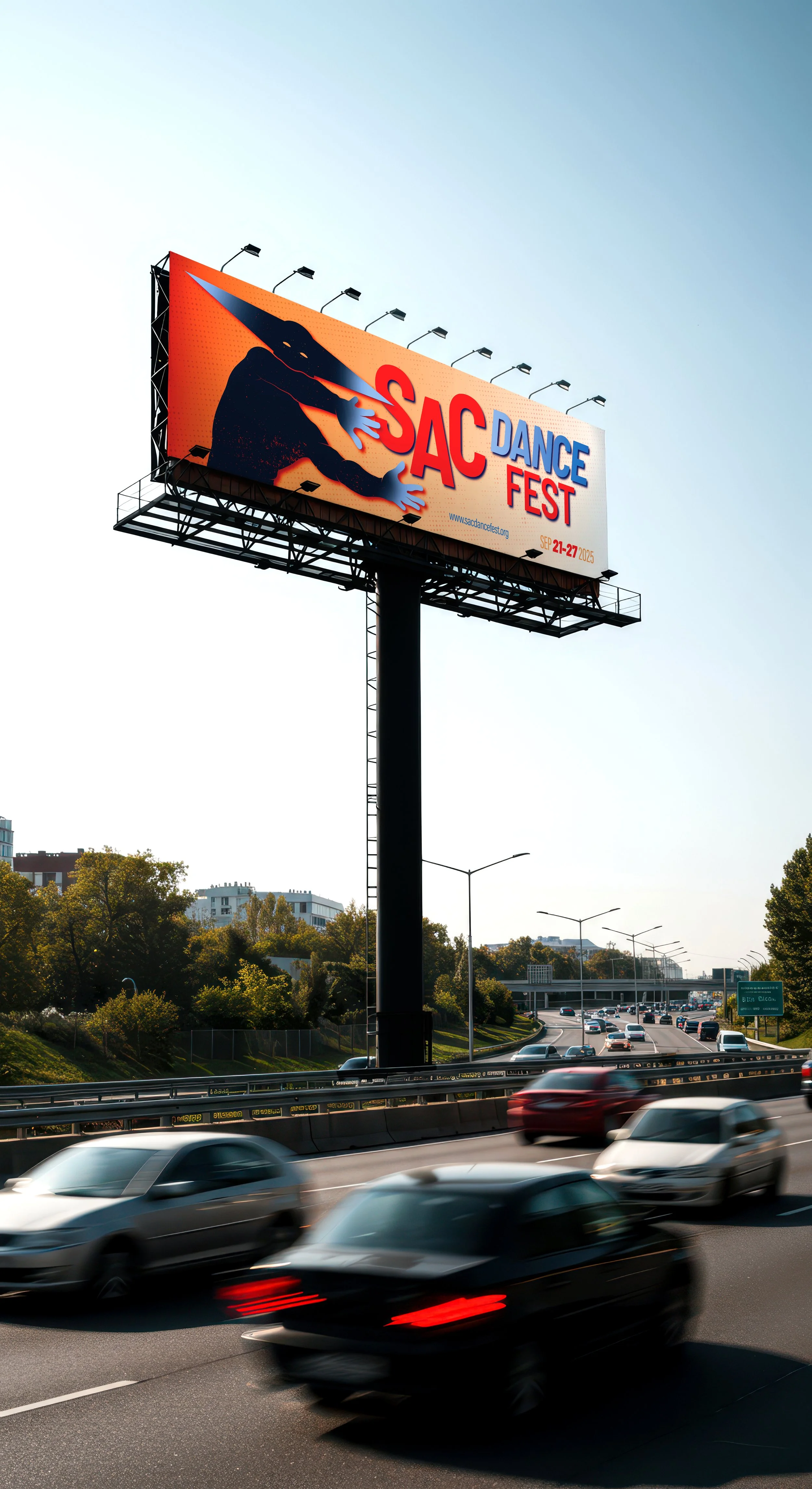
The Sacramento Dance Festival’s very first year, modeled after the American Dance Festival. It’s a week-long event designed to spotlight world-class contemporary dance and the cultural diversity of Sacramento. My role is to create the visual identity and campaign materials that set the tone — bold, authentic, and full of movement. This identity must serve to function across posters, banners, social media, and merchandise applications.


Design Solution
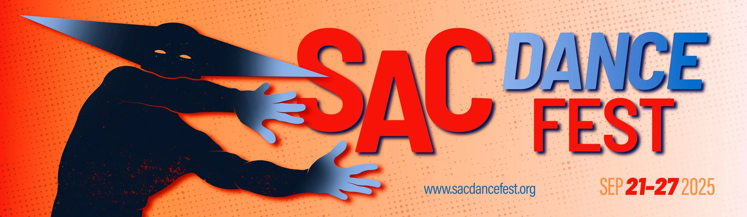
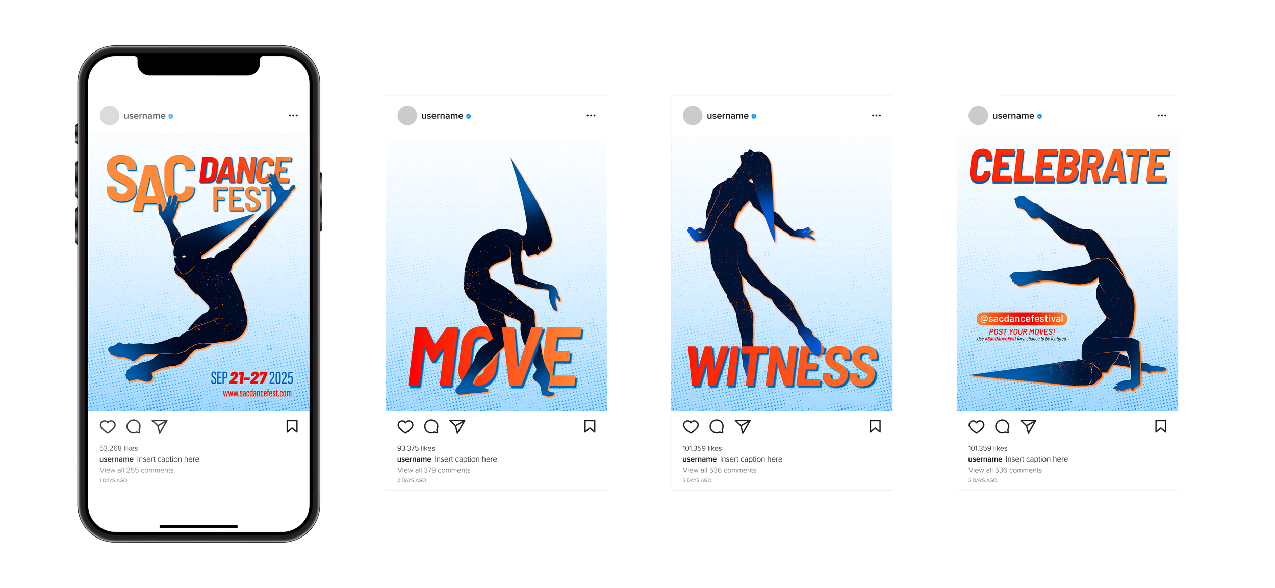
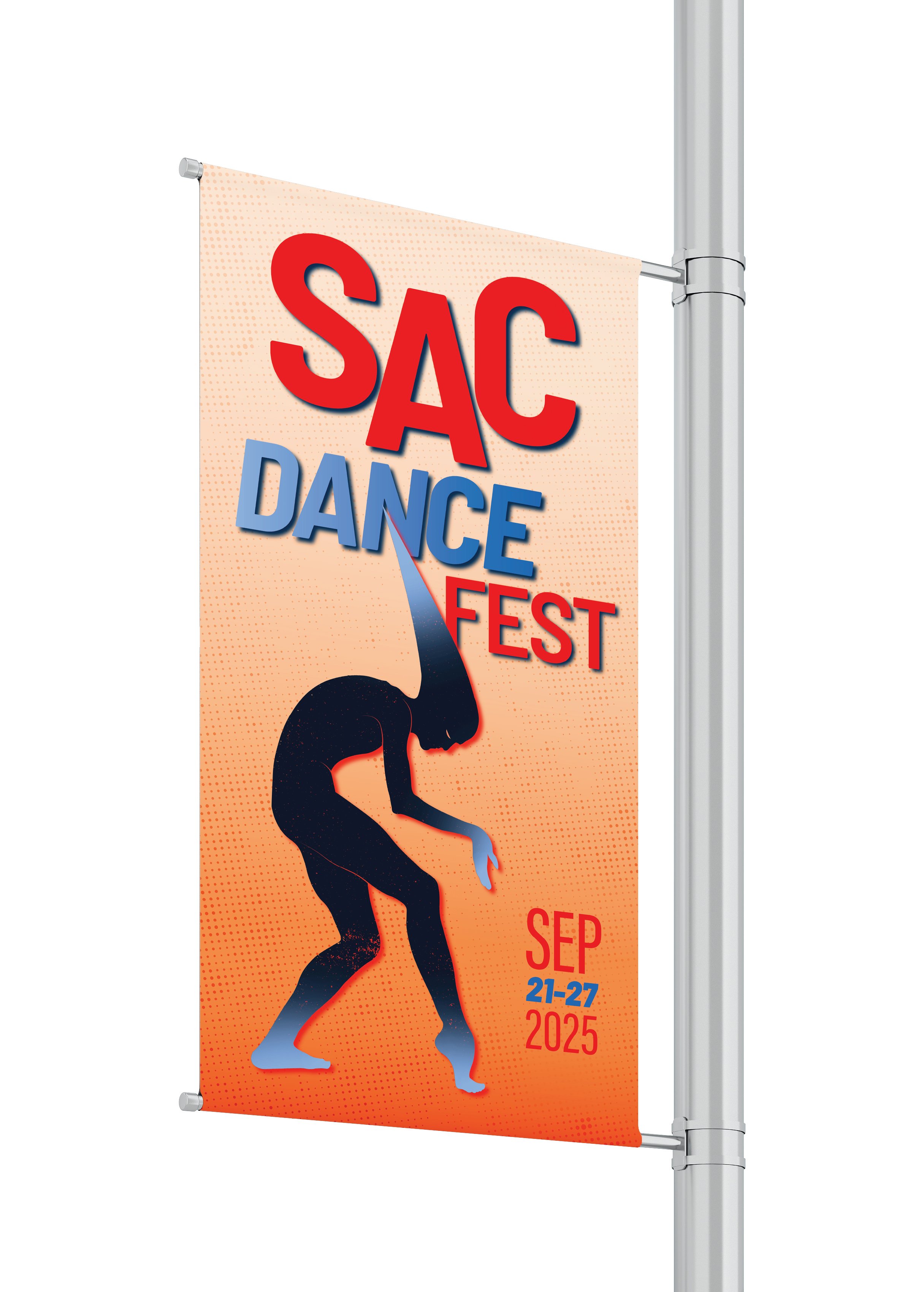
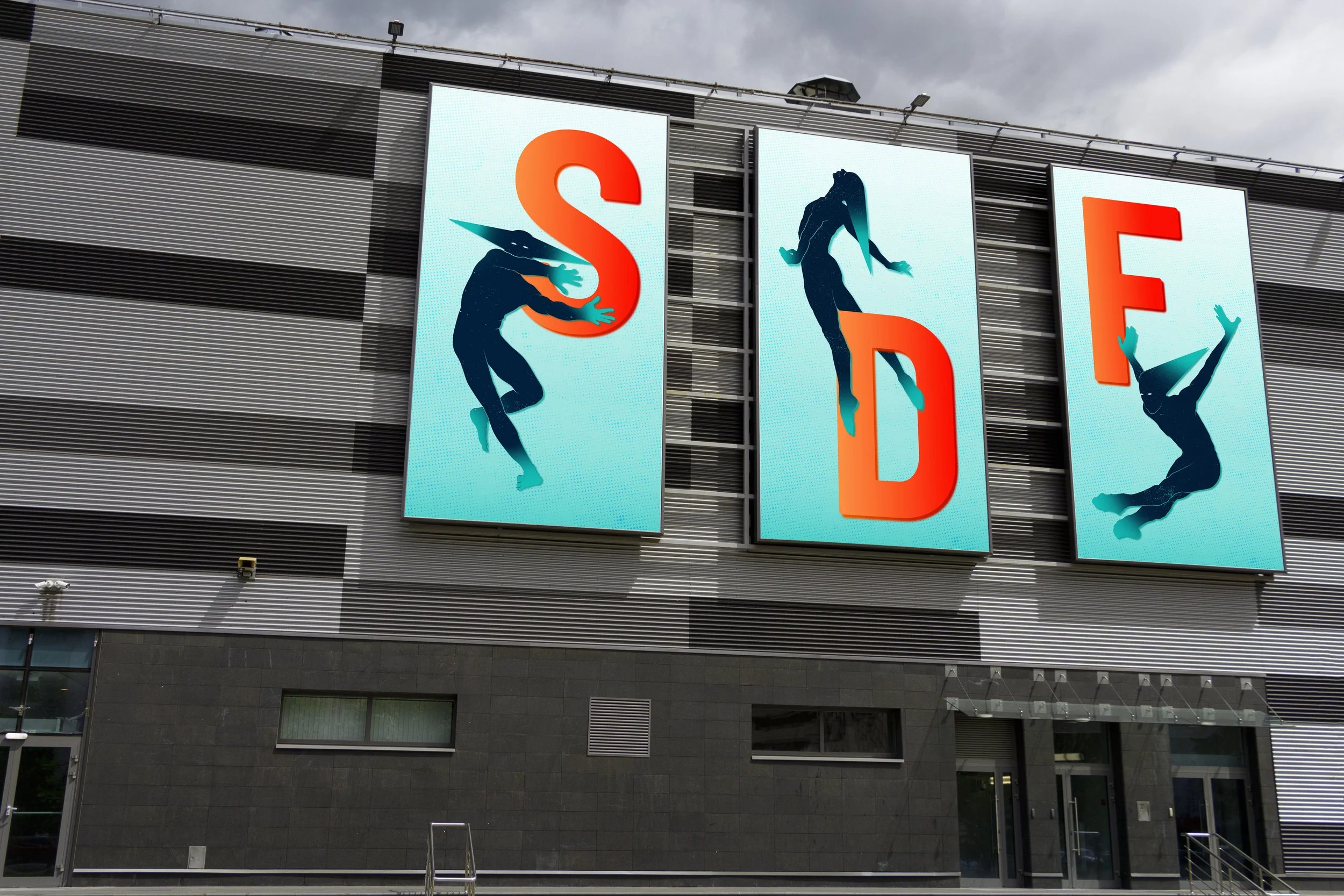
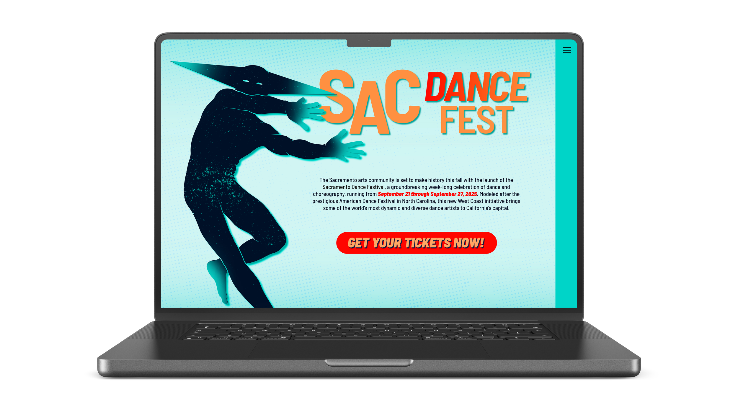
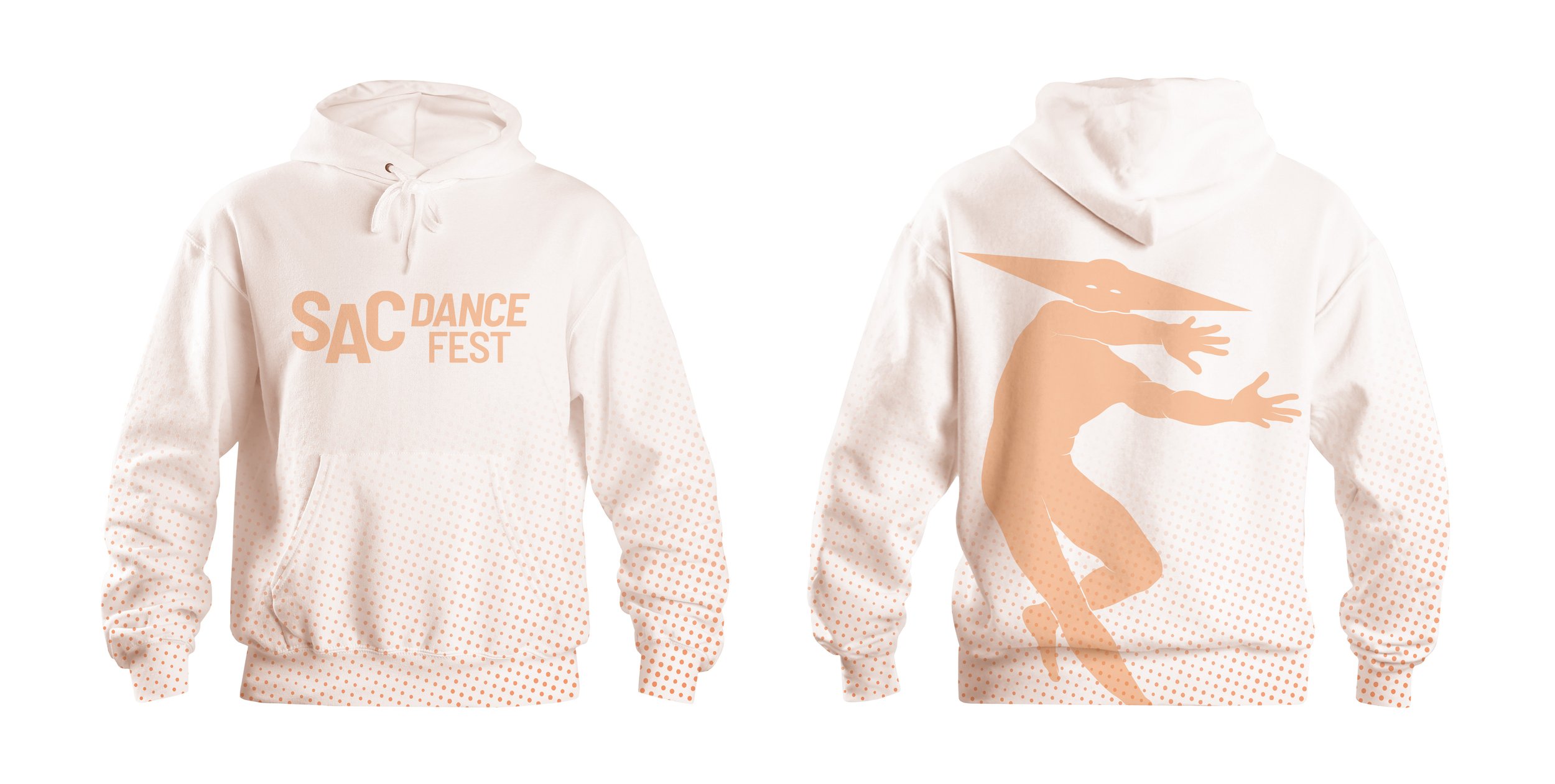
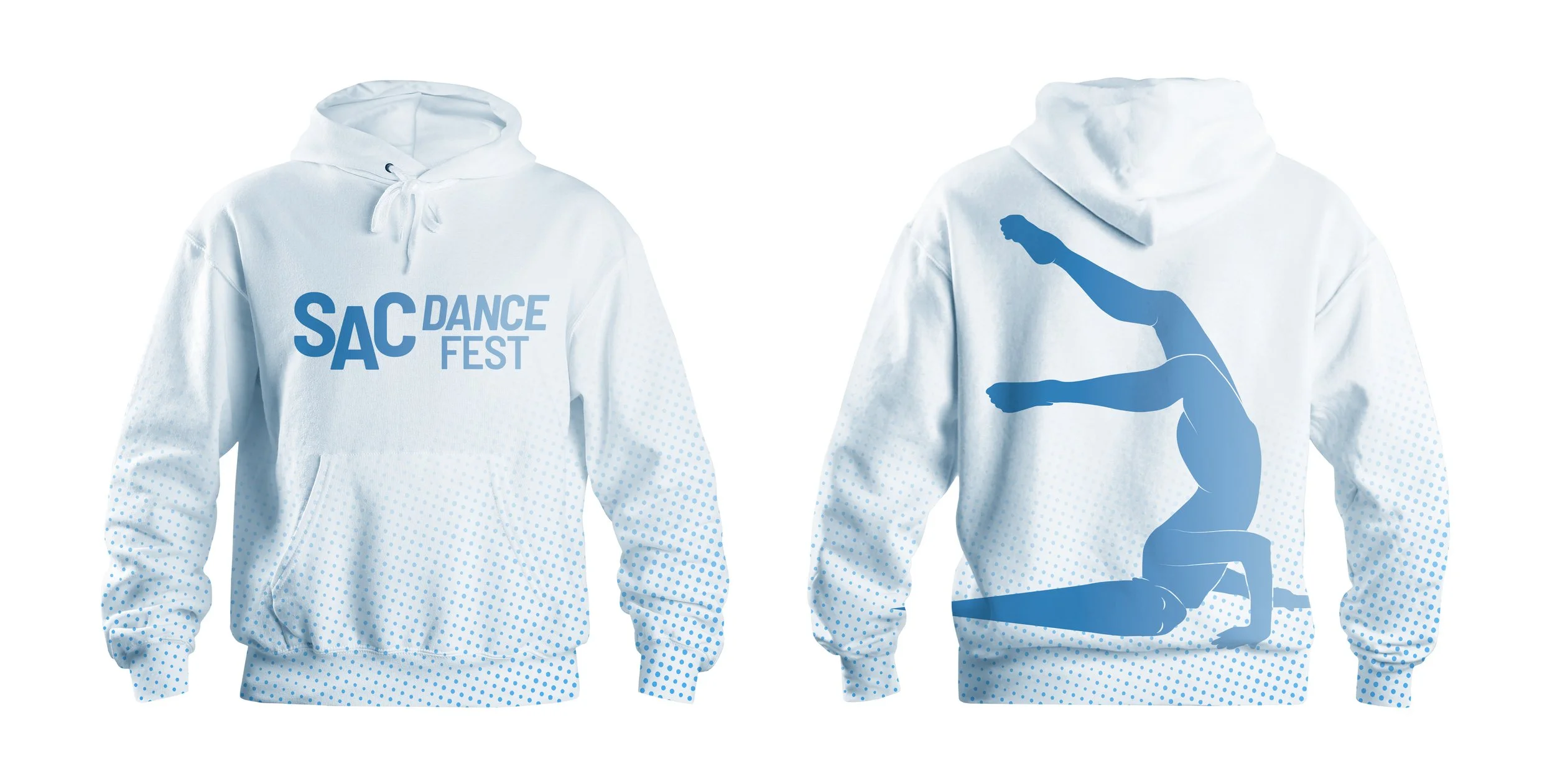
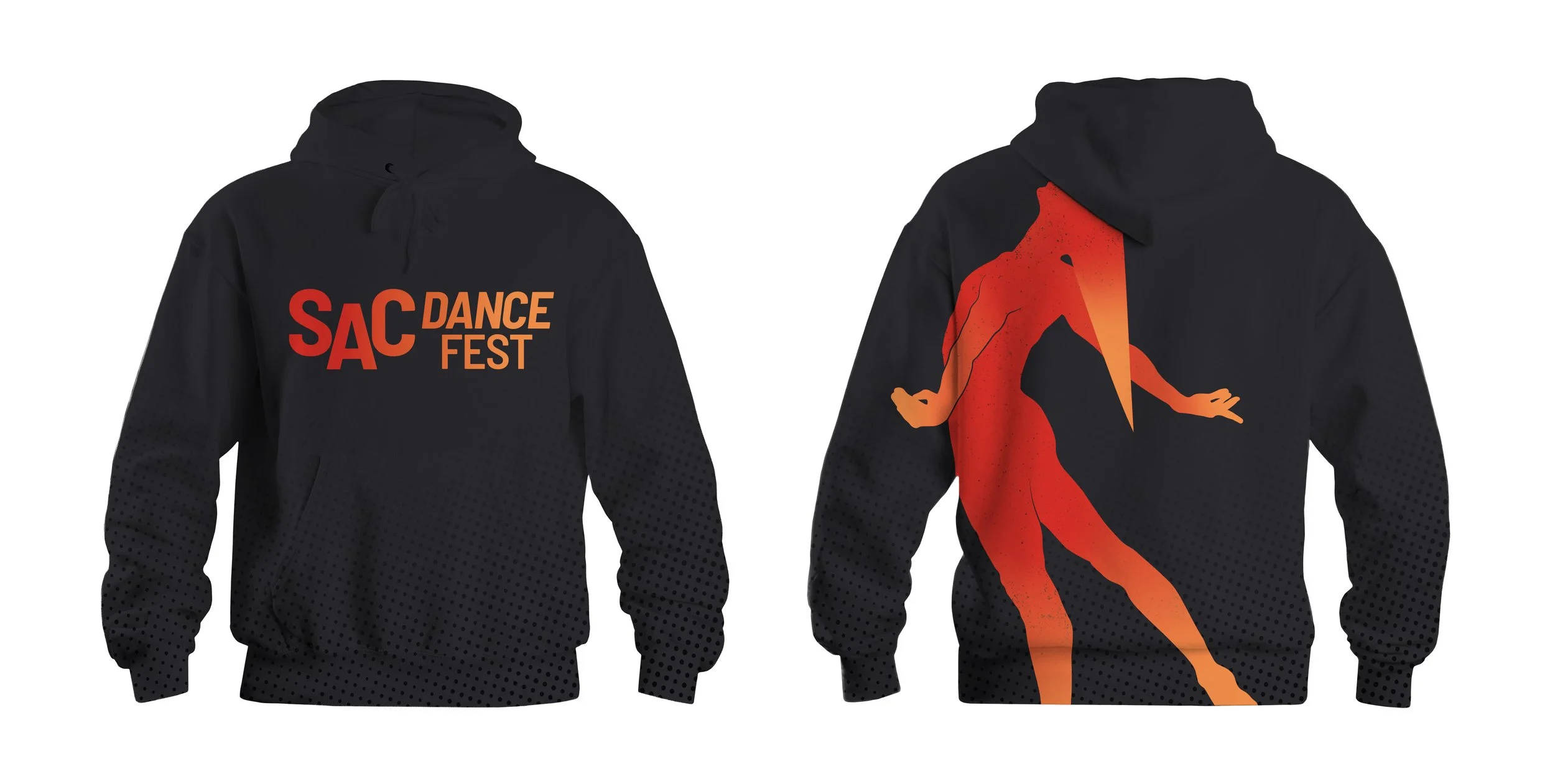
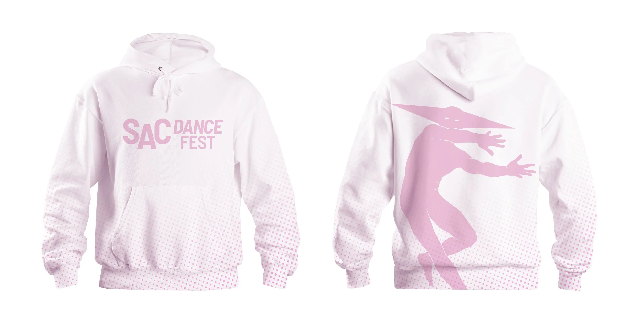
My solution features stylized dancer silhouettes capturing expressive poses. They emphasize the motion, flexibility, and physical tension that accompanies the various styles of dance that will be showcased at the festival. The simplified forms allow for strong readability at small and large scales, and avoid the cliche of most modern dance festivals that heavily rely on dance photography to advertise.
The typography is simple, bold, and legible for strong street visibility and a focus on the utility of quickly navigating a busy festival campus in an urban area. The type is occasionally integrated with the dancing figures to create visual interaction.
The color palette is a balance between bright warms and deep, cool blues, which establishes visual depth. Gradients are used to support the idea of the movement and kinetic nature of dance already being established by other brand elements.