
Nopalitos
Nopalitos is a popular, cozy southwestern neighborhood café located on the corner of 56th and H Street in East Sacramento, California. The existing brand is not only dated, but also inconsistent across all platforms, including 3 different logos for the website, menu, and café facade. This makes it difficult for the brand to stand out or remain recognizable.
This project reimagines the Nopalitos brand into a coherent system that preserves the café’s identity. The objective was to create a bold, contemporary mark that exudes the warmth and craft of southwestern cuisine.
Design Solution
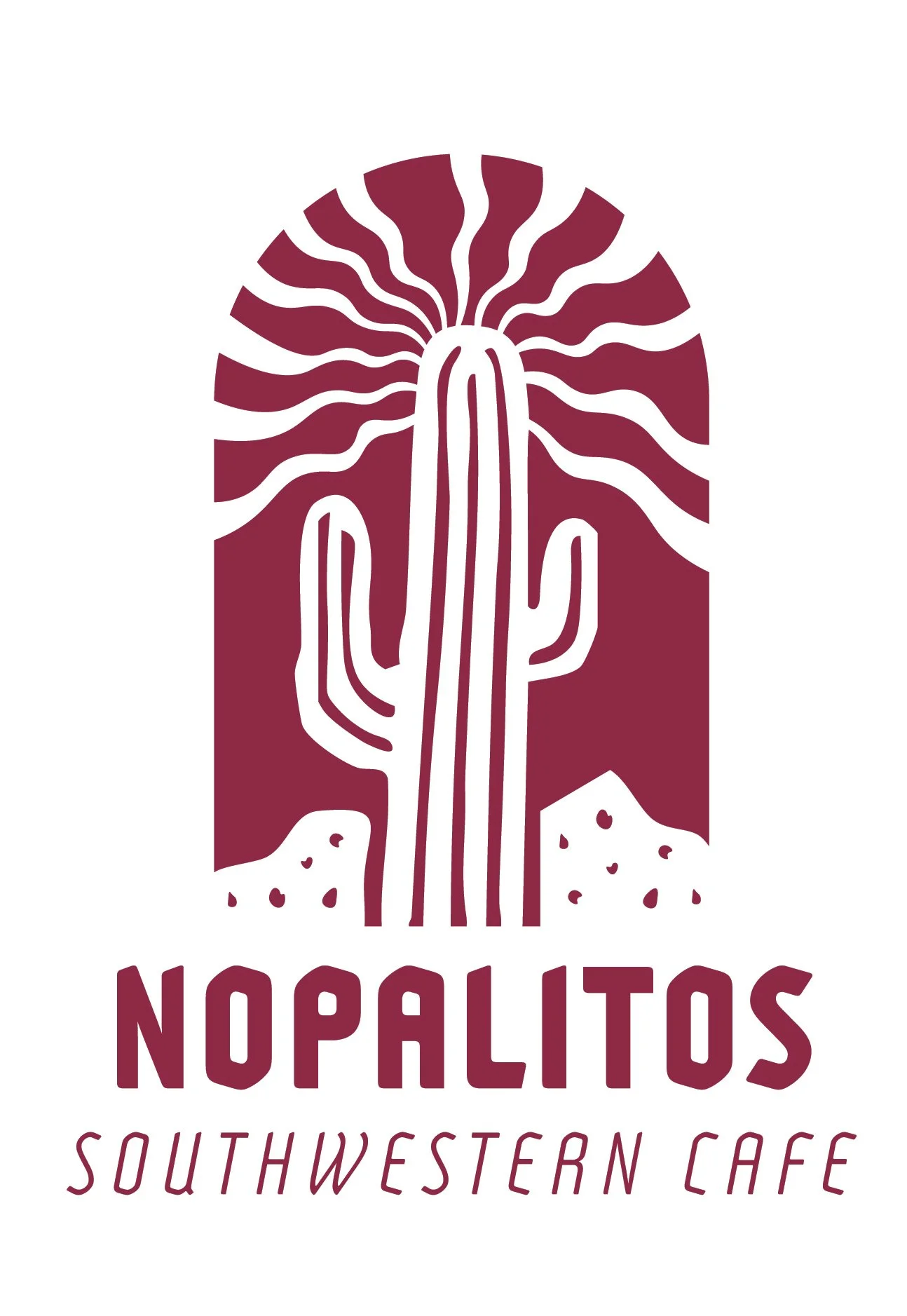
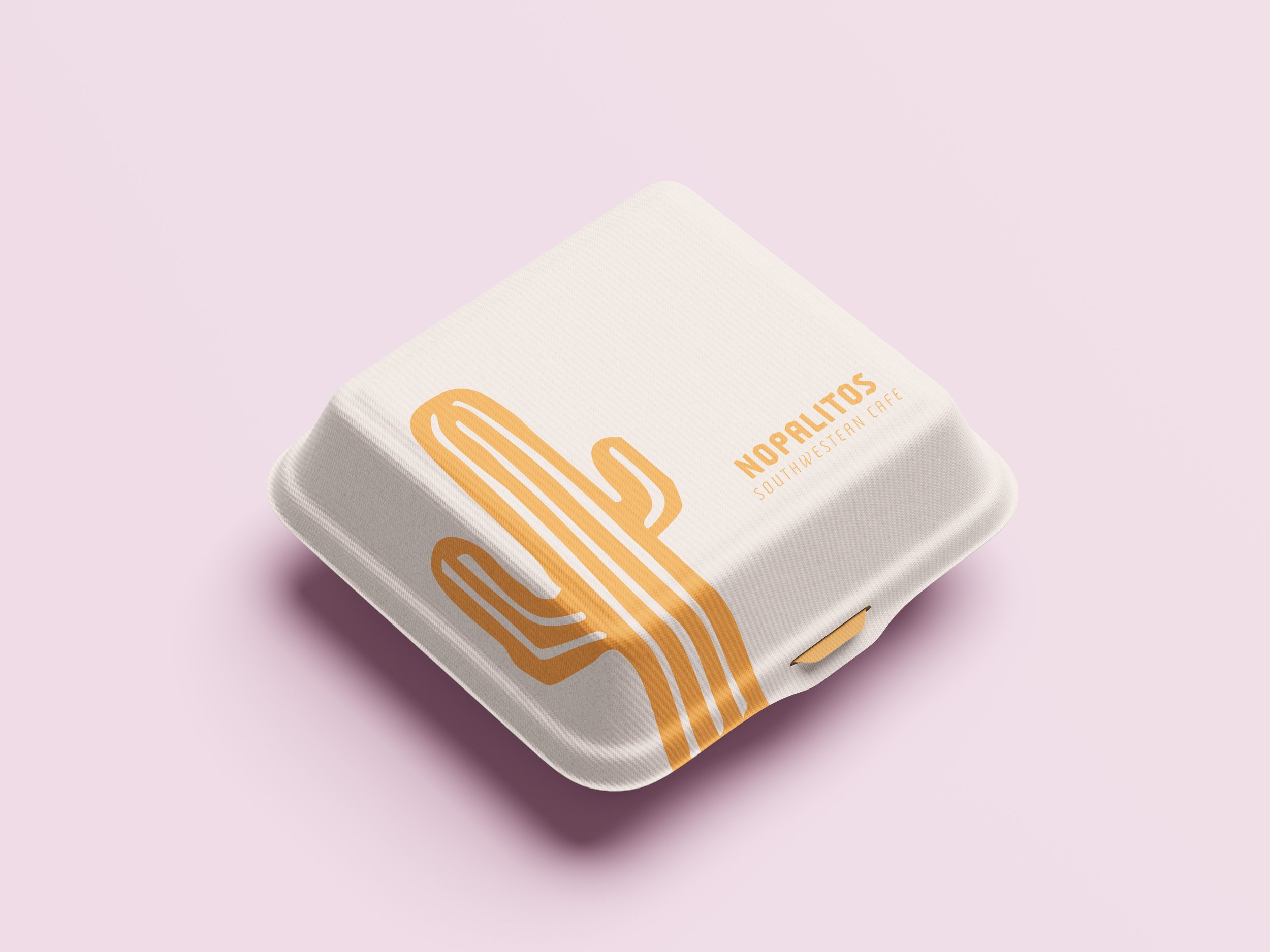
The new identity centers around a simplified cactus emblem that is inspired by the southwestern desert landscape. It has a vertical structure for a strong silhouette that creates a recognizable similarity to southwestern architectural archways. The mark and logotype include a reduced visual complexity from the original logo, and can be separated and used in different contexts for both small and large applications.
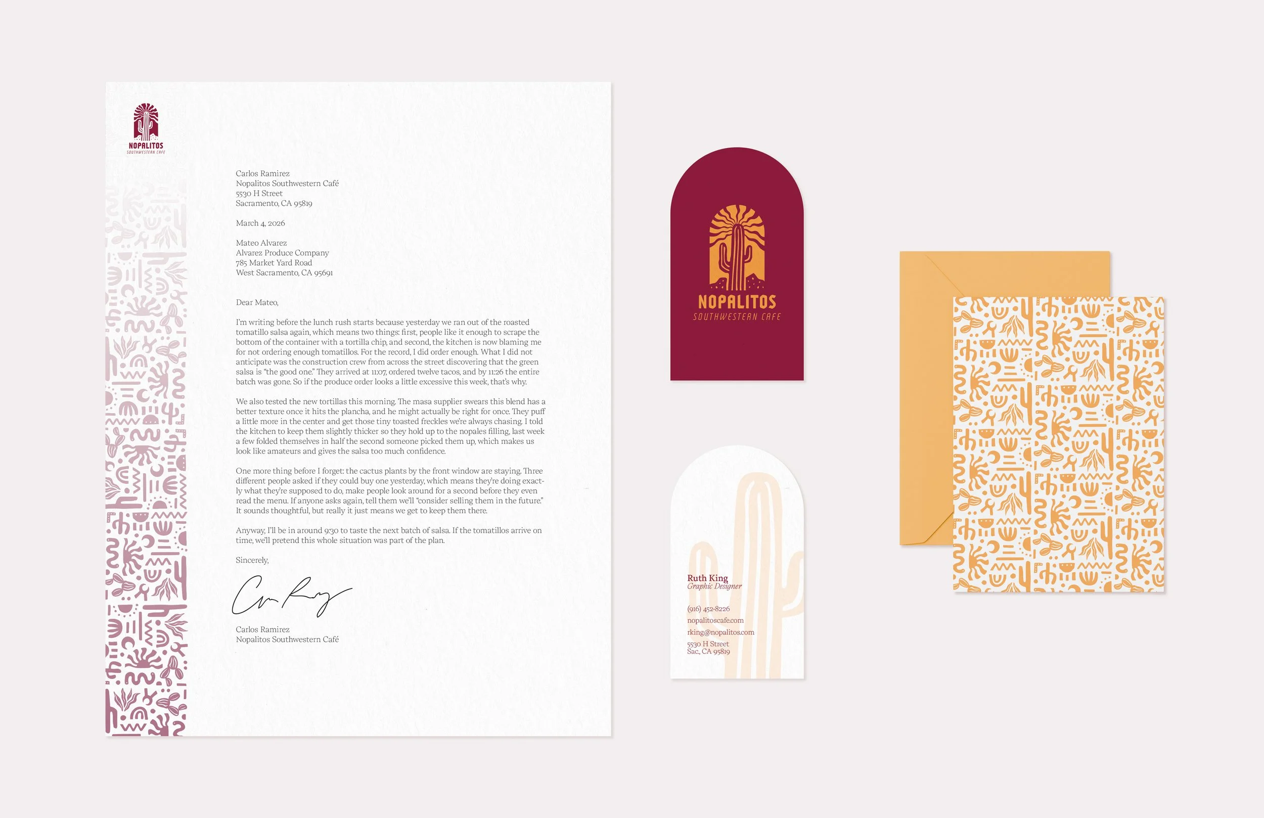
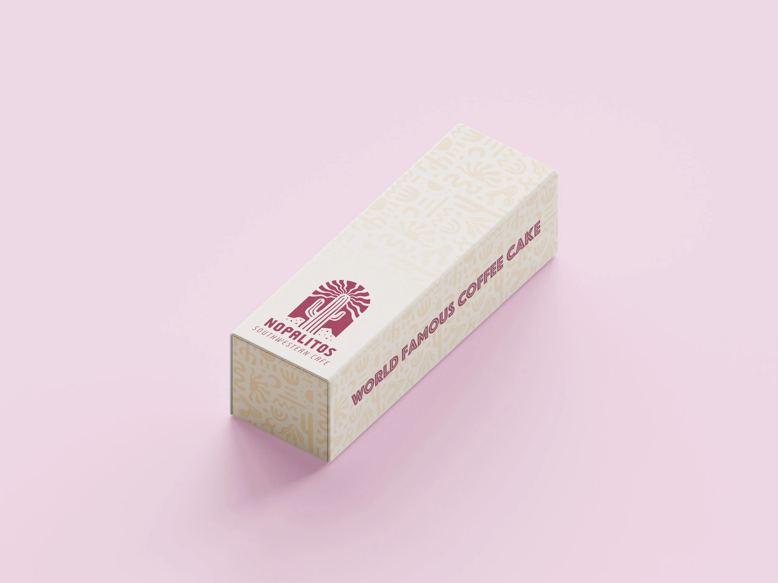
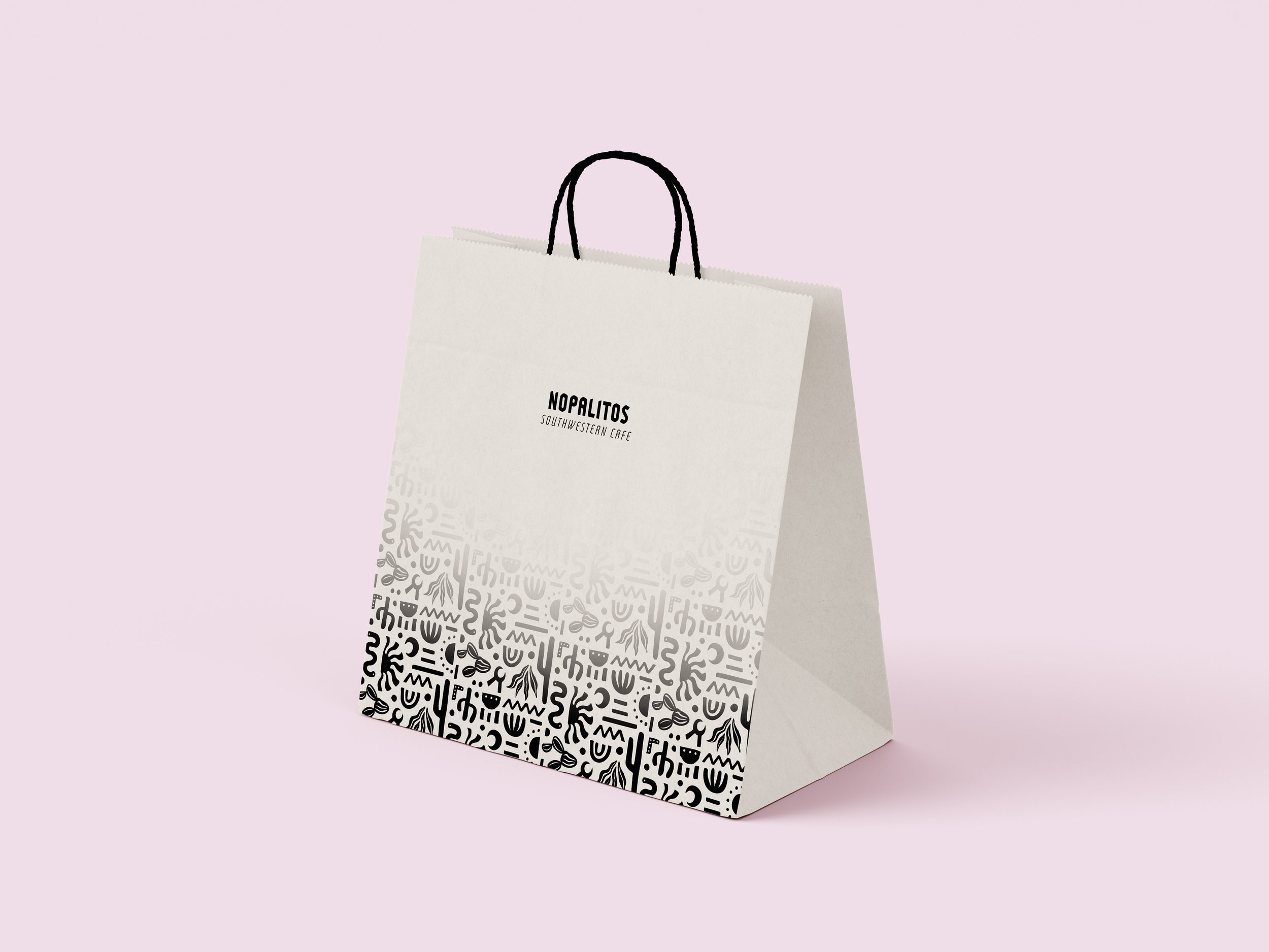
The pattern features a library of abstracted southwestern motifs that reinforce the logo's aesthetic of icons representing natural elements and regional craft. It can repeat and scale, and acts as a secondary graphic language across materials.
The color palette is saturated yet refined, reflecting bold southwestern flavors. They avoid becoming overly rustic or playfully childish. The rich, warm red-violet is often associated with the chili peppers and dried spices that are featured in the café’s interior decoration. It acts as the anchor, establishing a strong presence and high contrast capabilities. The golden yellow references sunlit desert tones, as well as secondary culinary ingredients like corn and tortillas. It suggests warmth, hospitality, and energy, and can highlight key brand elements. The accent color, lilac, is a softer supporting color that balances the heavier warm tones. It is inspired by desert flora and helps the palette feel more contemporary and less predictable.
The logo, pattern, and color work together as a flexible system enforcing consistency across brand touchpoints.