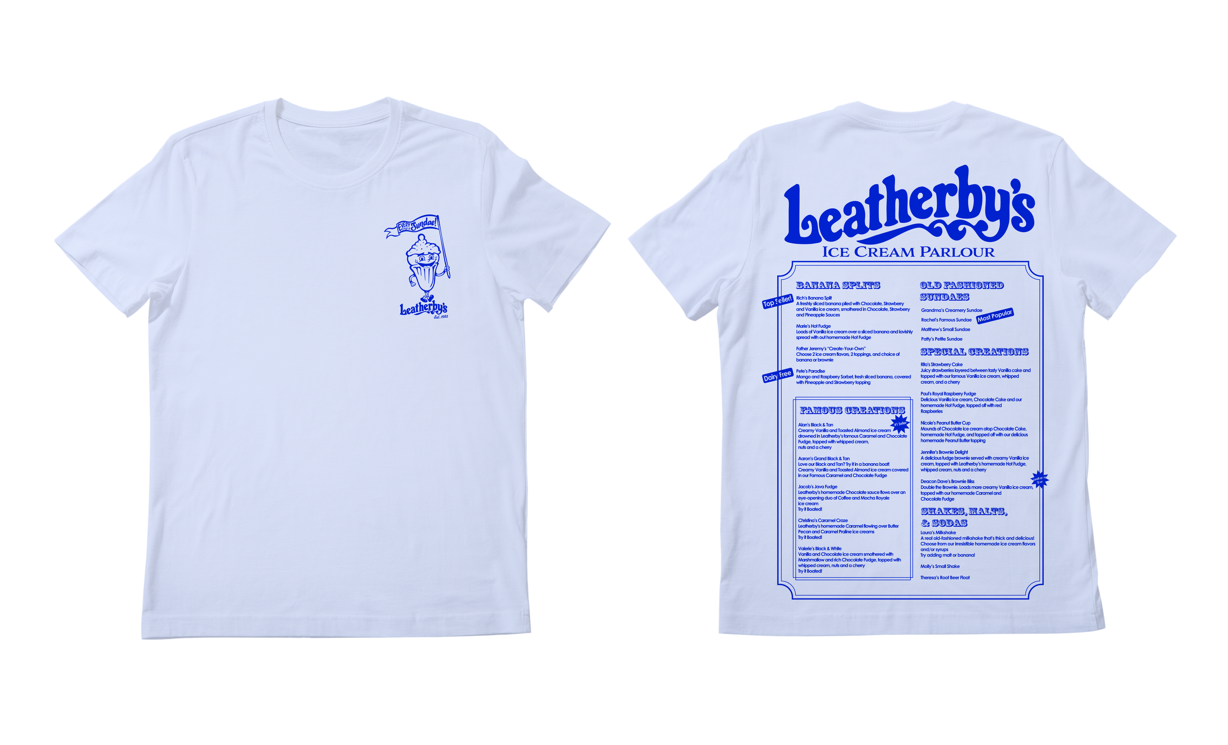
Leatherby’s Family Creamery
Voted as #1 ice cream in Sacramento for over 40 years, Leatherby’s commitment to excellence has always remained the same. They are known for their warm and dignified treatment of their guests, the highest quality ice cream and food, and giving back to the community that helped them become who they are today.
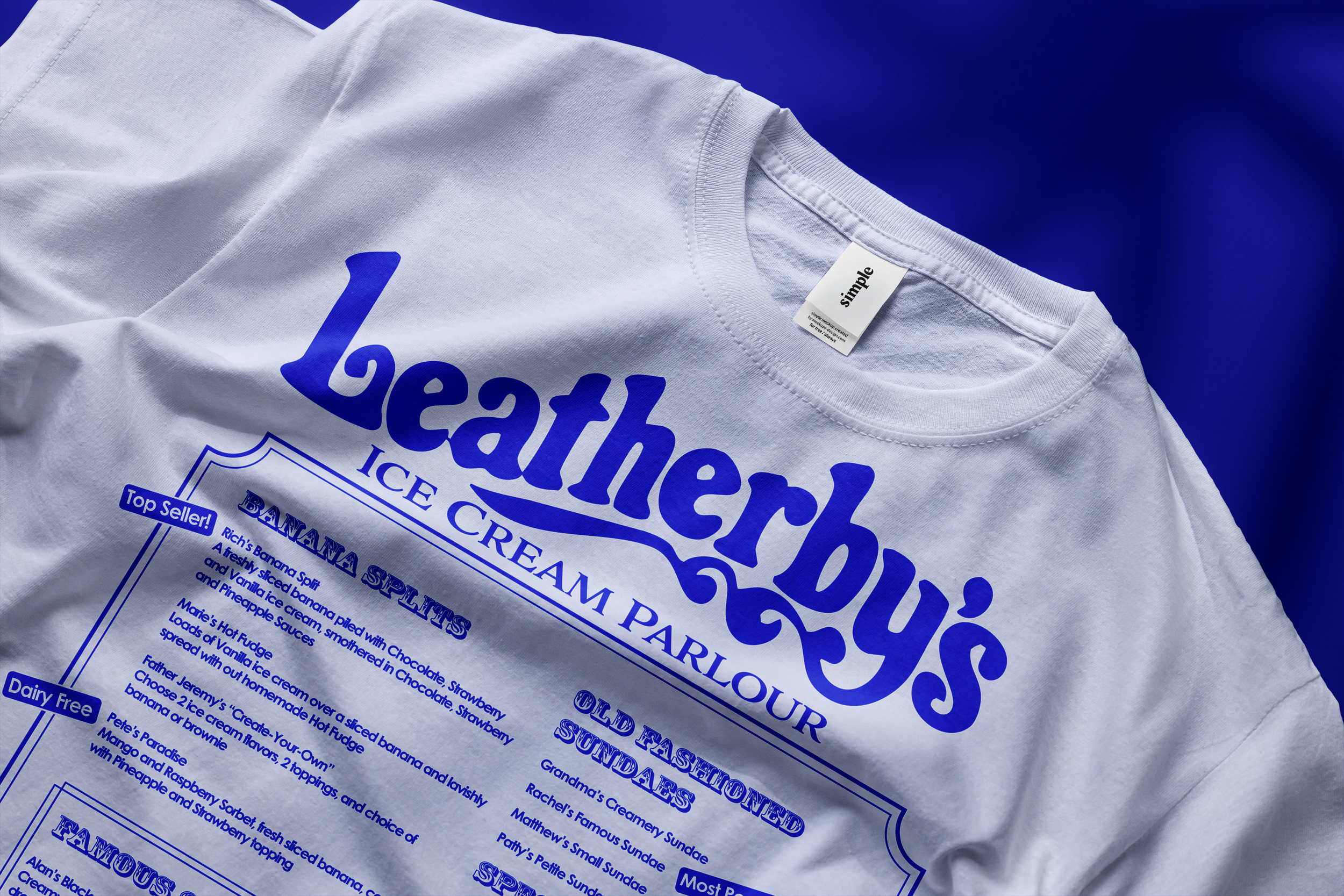
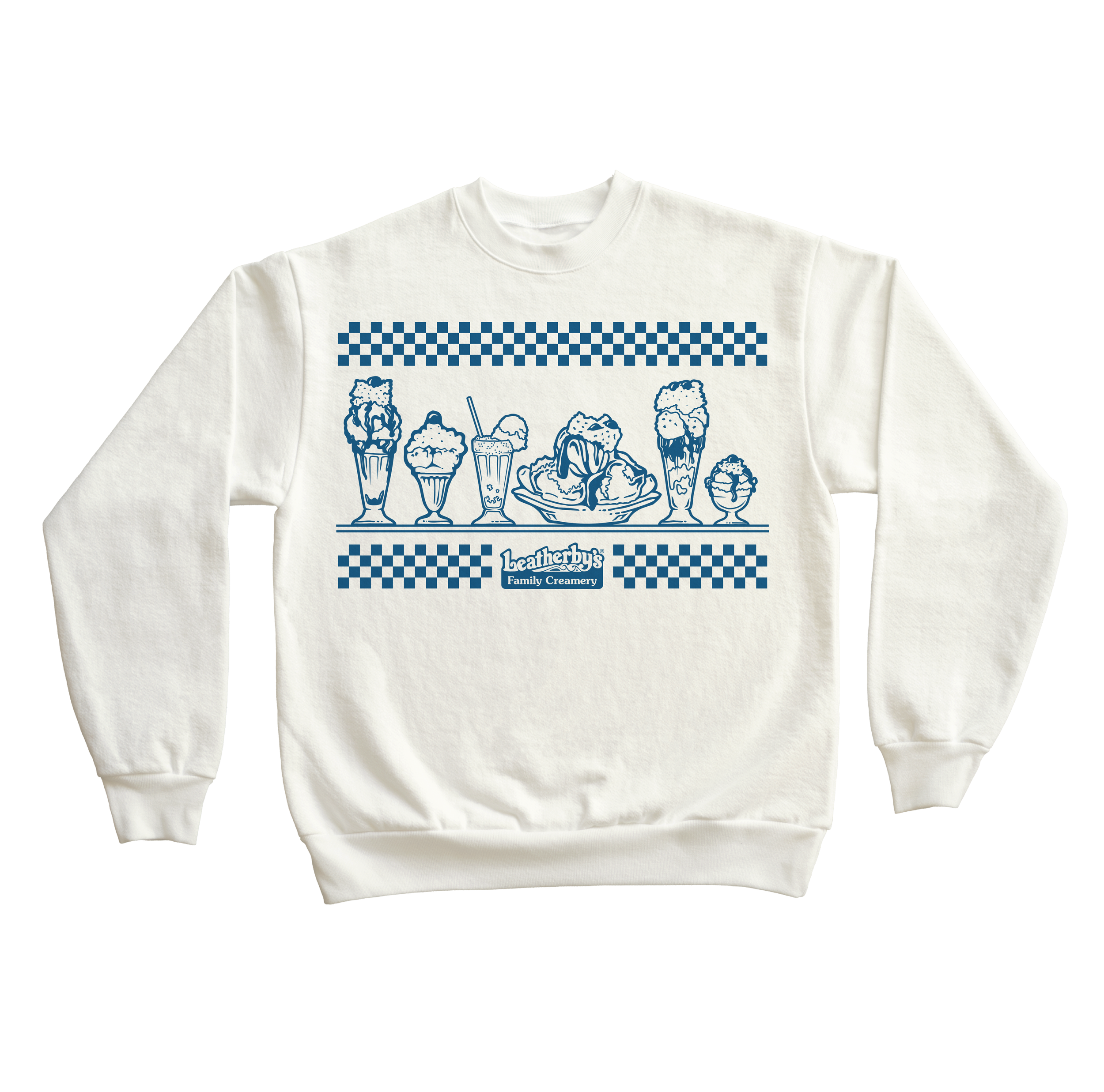
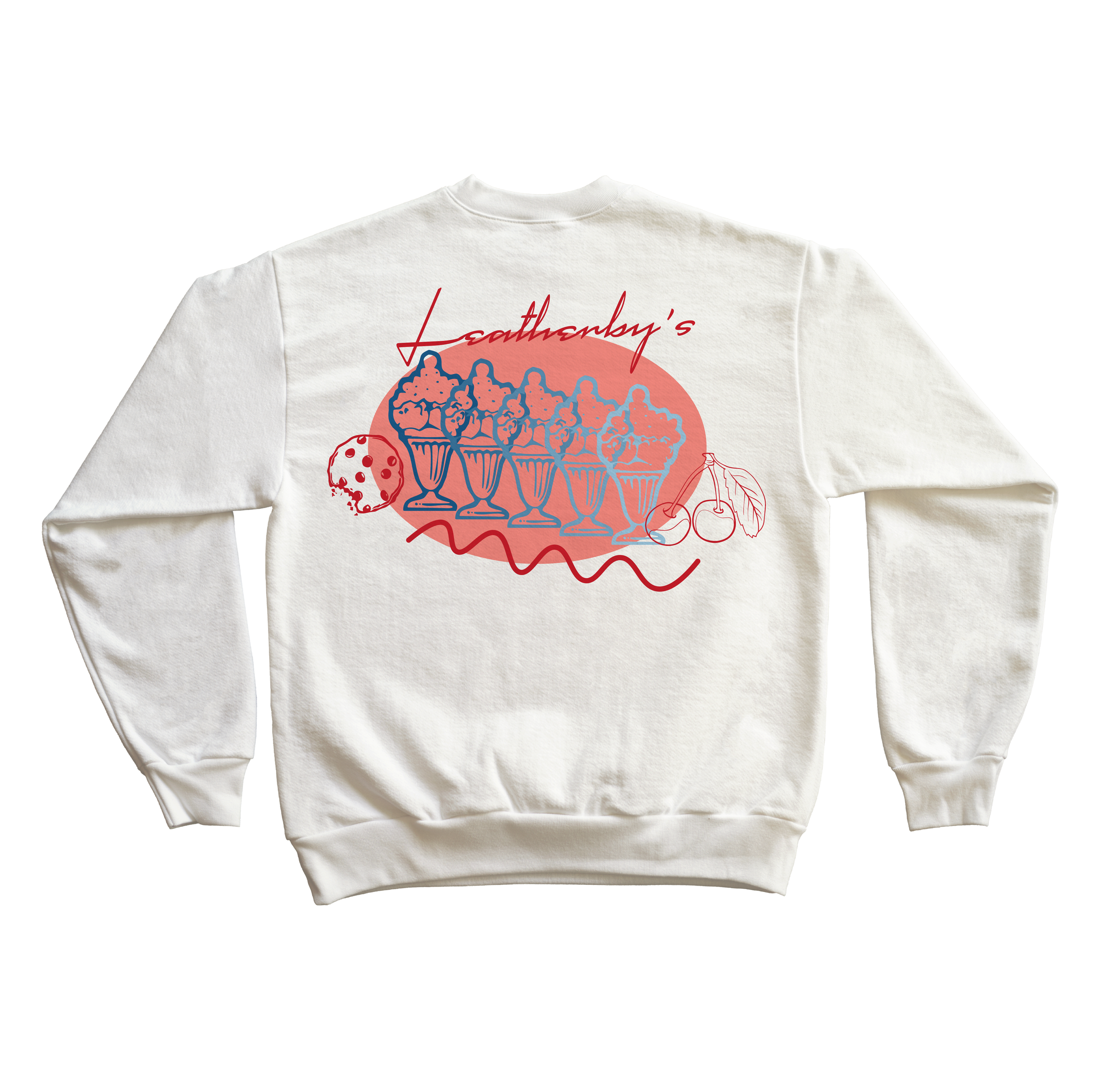
The goal of each project throughout the years was to create modern applications of the brand while preserving its nostalgia.
Design Solutions
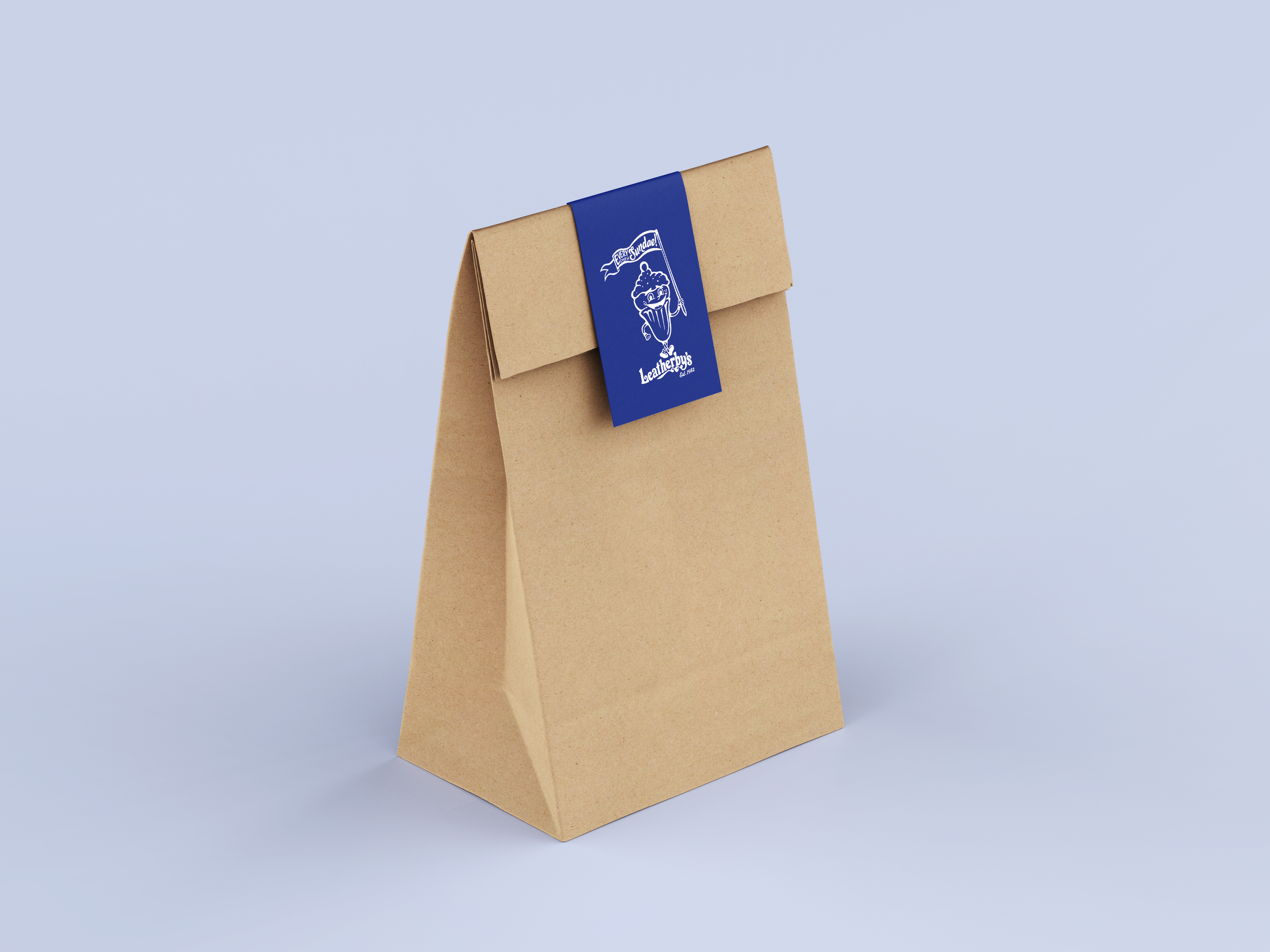
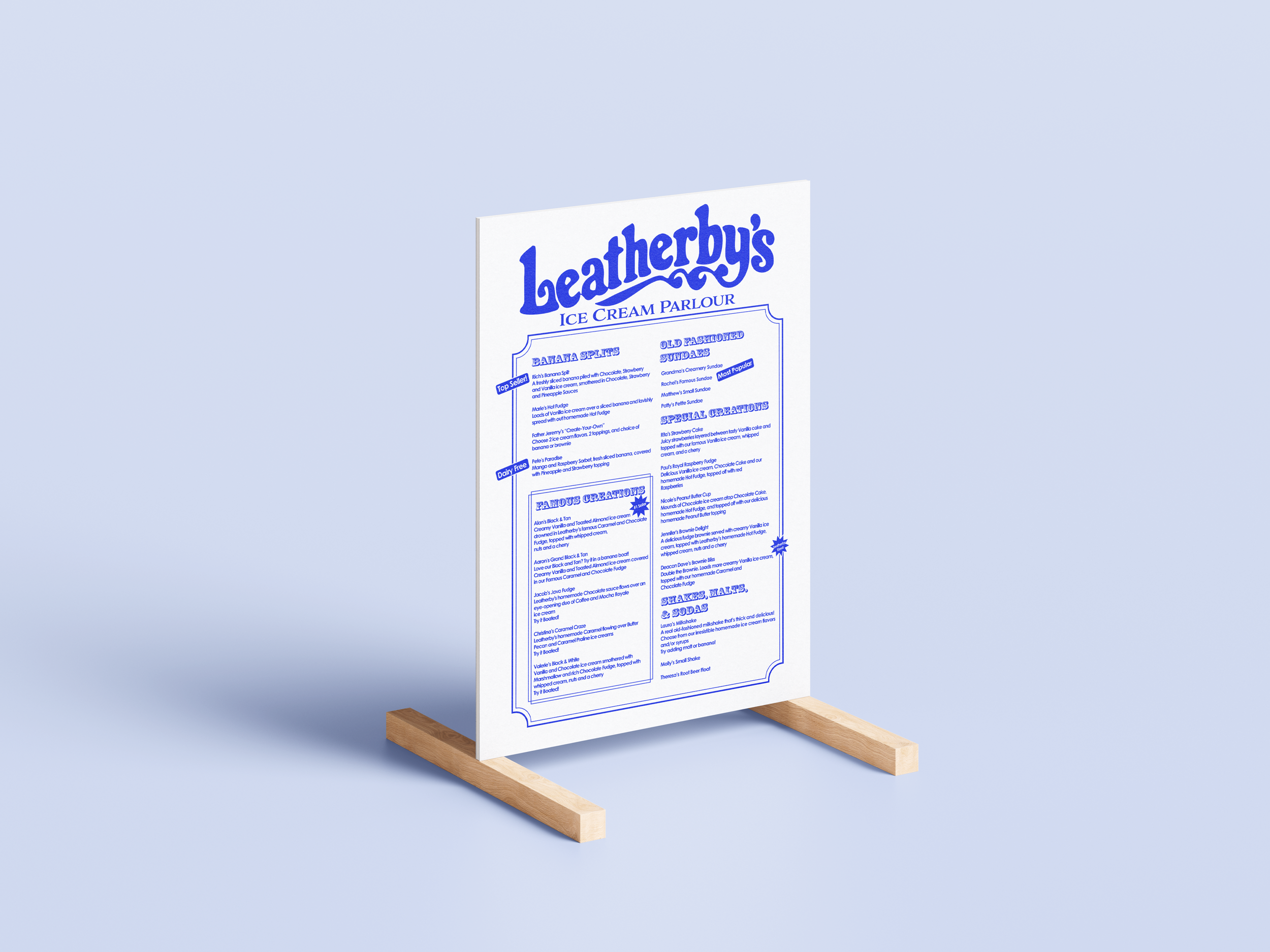
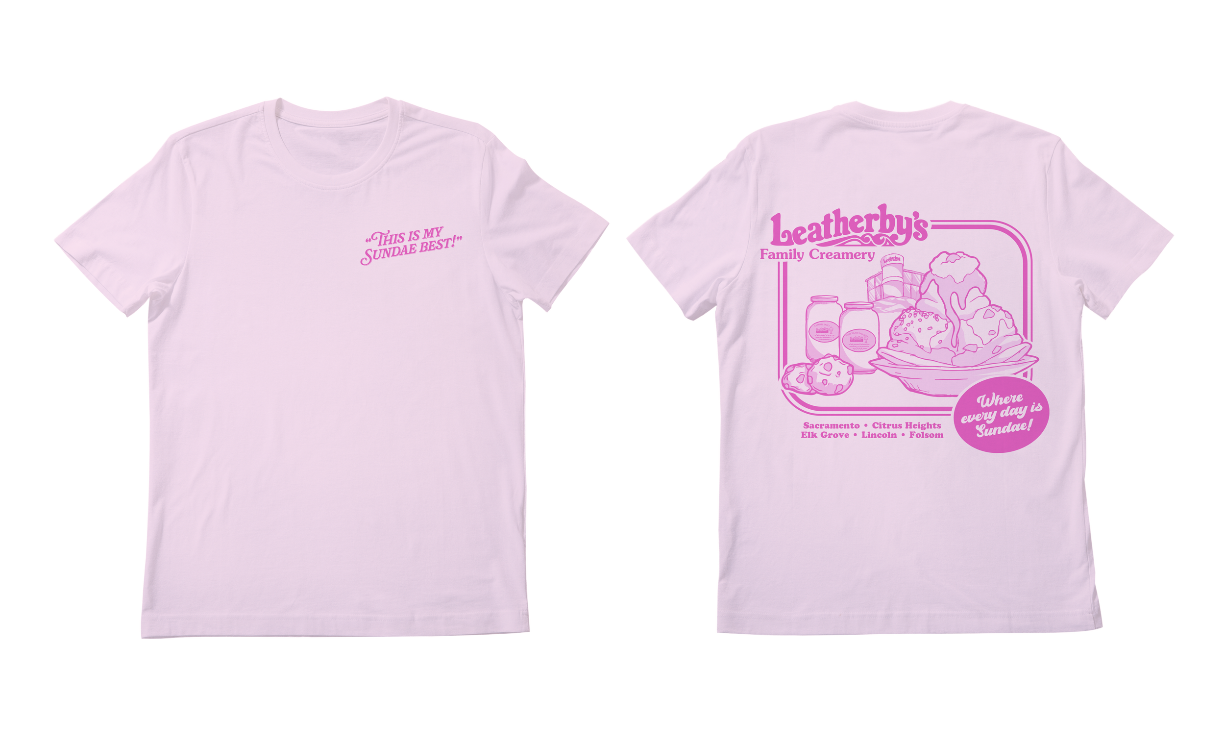
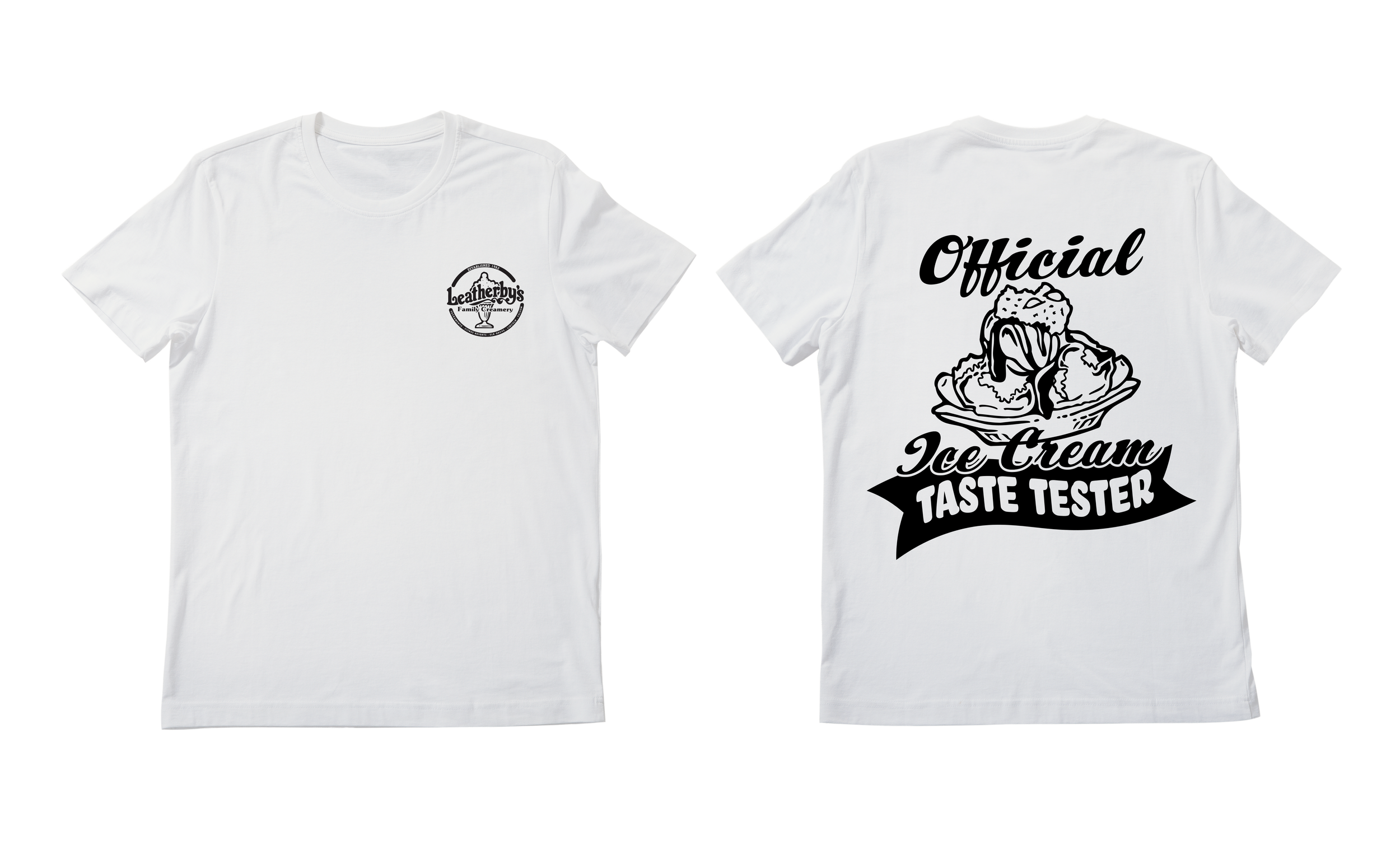
For each edition of the merchandise I used a similar style of illustration that is playful yet detailed. I wanted the illustration to reflect the richness of the Leatherby’s product, as well as their approach to service. The typography includes nostalgic scripts that offer a nuance of boldness and a contemporary aesthetic. This system supports seasonal drops and merchandise that feels collectible. It balances heritage and freshness.