
Where you're treated like royalty.
Where you're treated like royalty.


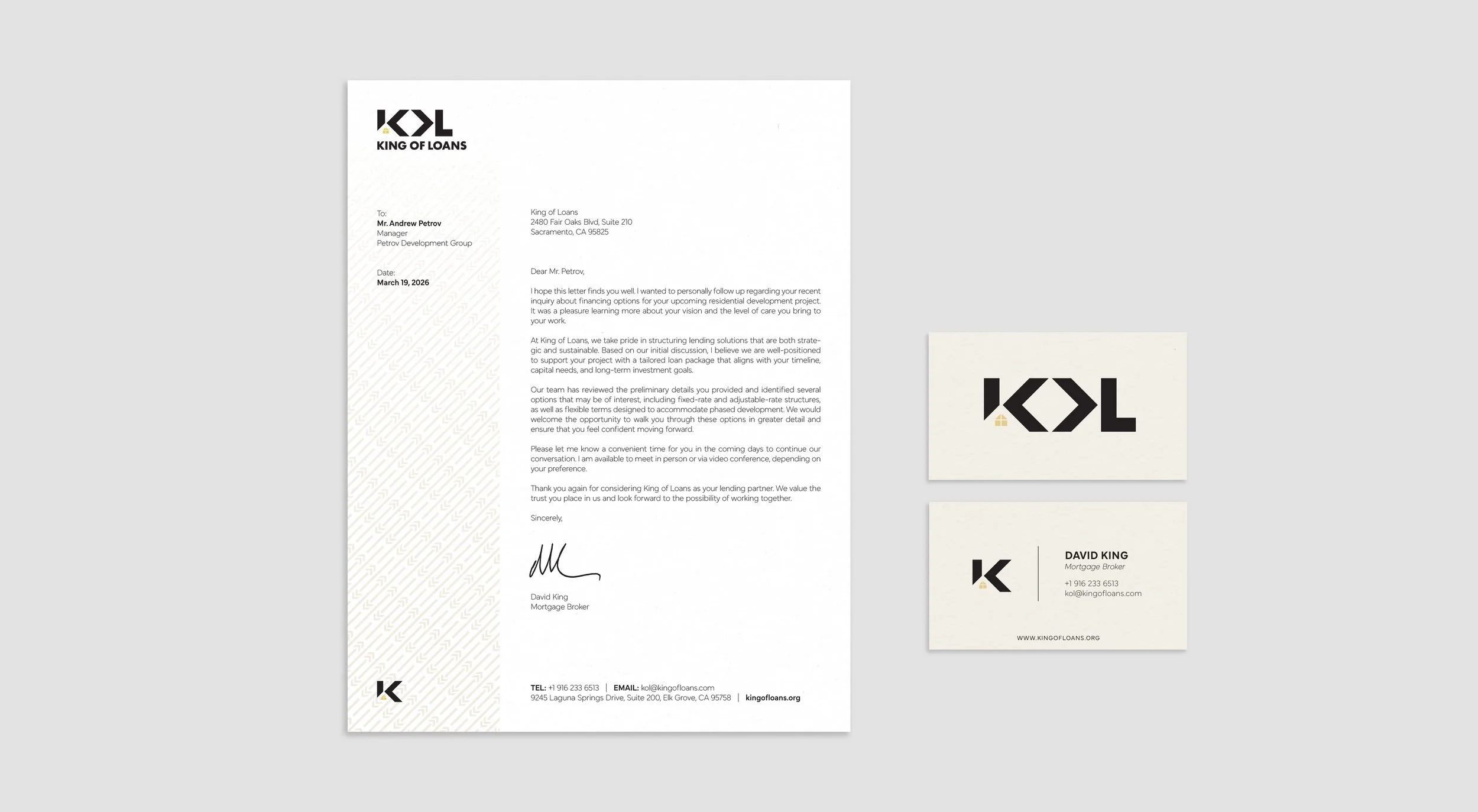
At King of Loans “where you’re treated like royalty” is not only a catchy tagline but something we strive to do for each of our clients. From initial contact to close and thereafter, we make our clients feel special and show them what great service looks like when buying or refinancing their home.
Design Solution
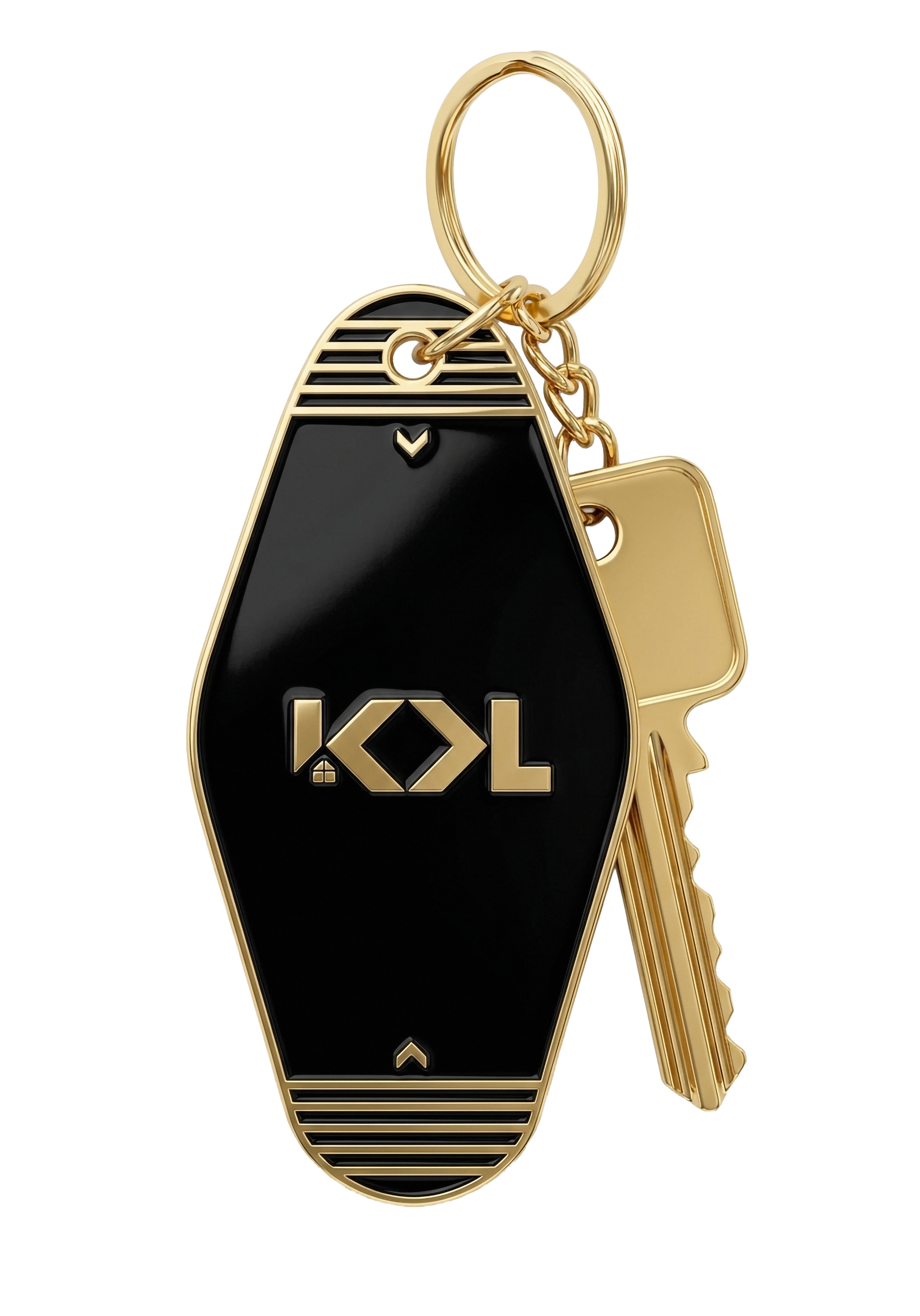
The original branding is dated and visually cluttered. The simulated gold look, created by gradients, greatly adds to the outdatedness.
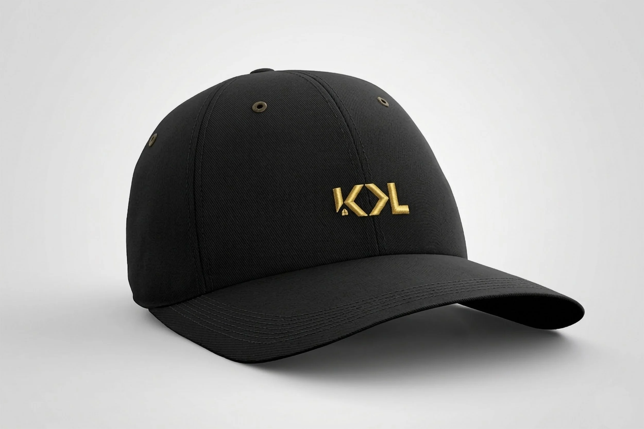
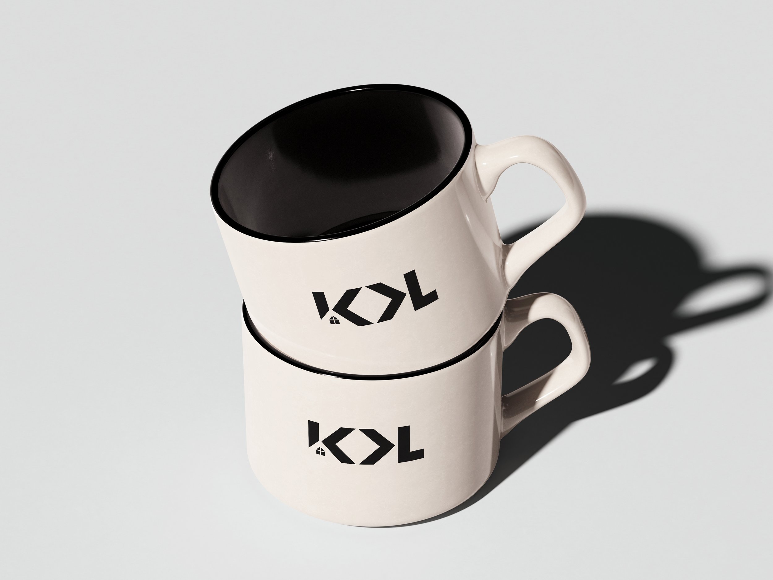
The logo I designed makes use of the same kind of closure and negative space that can be seen in the original logo. I employed strong structural geometry along with a black, gold, and neutral color palette to communicate stability and value. The open space makes the logo feel fresh and modern with angles that express momentum.